-3.png)
Hello there! It's been a while since our last release in June. We've been hard at work for over four months to bring you a bunch of new features and improvements that will help you and your team to design faster and collaborate better with our tools.
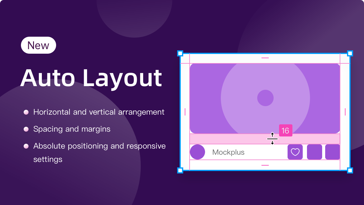
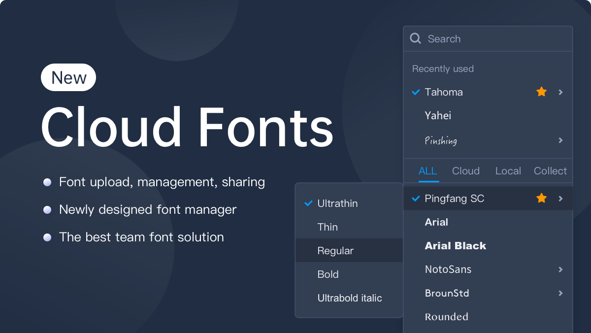
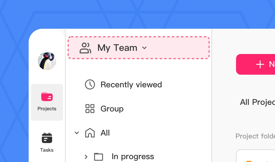
With Mockplus RP, you can now import Axure files for further editing and collaboration, and try more features, such as the ability to export artboards as PDF files, Smart Fill, Dark and Light themes. Our UI design tool, Mockplus DT, now has been highly upgraded with special Development and Comment modes, Auto layout and more new updates.
Let's first check the key updates:
Mockplus RP
Mockplus DT
Mockplus Cloud
For now, let's dive into the details for a clearer understanding:
Mockplus RP ( for online collaborative prototyping)
Import Axure files for further editing and collaboration
We have exciting news for our dear users who are also using Axure!
If you are hesitant to switch from Axure to Mockplus RP because of its inability to import Axure files for quick data transformation, worry no more! Mockplus RP now offers a new feature for you to import Axure files in just a few clicks.
After the import, most of your file data will be retained, including your layer data, interactions and far more. Most importantly, you can also easily make further edits to interface details, collaborate with your team, share and test them right in the browser, collect feedback, and even handoff them to developers via a single link – all in Mockplus.
Though this new feature is still in beta testing, it will surely save you not just hours, but possibly days of work! Let's try it now!
.png)
New default components, like Dynamic Panel and Accordion Menus
Apart from the new component libraries, we have expanded our Default library to include more advanced components to empower your prototyping, such as:
1.Dynamic Panel - creating carousels, slideshows and content switching effects fast
Dynamic Panel is a versatile container that allows you to incorporate multiple States for holding distinct pieces of content and seamlessly switching between them within the same area of your user interface. It works like the existing Content Panel, and provides more unique features, like:
Nest with each other for creating more dynamic and complicated content switching
Drag and drop the content States to reorder them according to your needs
Adjust the number of States you can place in a single row with just one step
And much more

2.Accordion Menu - creating expandable accordions, navigation menus, FAQs and more
Accordion Menu is a menu and navigation component that vertically organizes a list of headings which can be expanded or collapsed to reveal or hide secondary content underneath.
It's essential to note that, at the moment, the Accordion Panel component supports only one level of content nesting. Under each title, you can create a maximum of one level of content. This simple nesting structure makes a nice tool for you to expandable navigation menus, FAQs and product presentations.
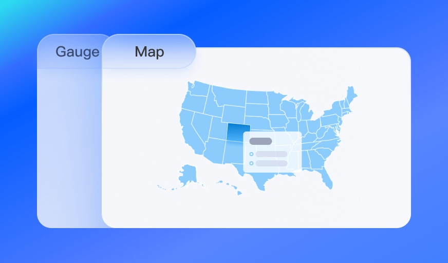
3.New Gauge Chart - -visualizing your data in a dial chart format
A gauge chart is an interactive data visualization that presents data in the form of a dial, which helps you to visualize your design data in a more intuitive and compelling manner. What's more, it is an interactive component, allowing users to interact with the data chart during the preview.

4.More component improvements
We've made further improvements to our components to simplify your design process.
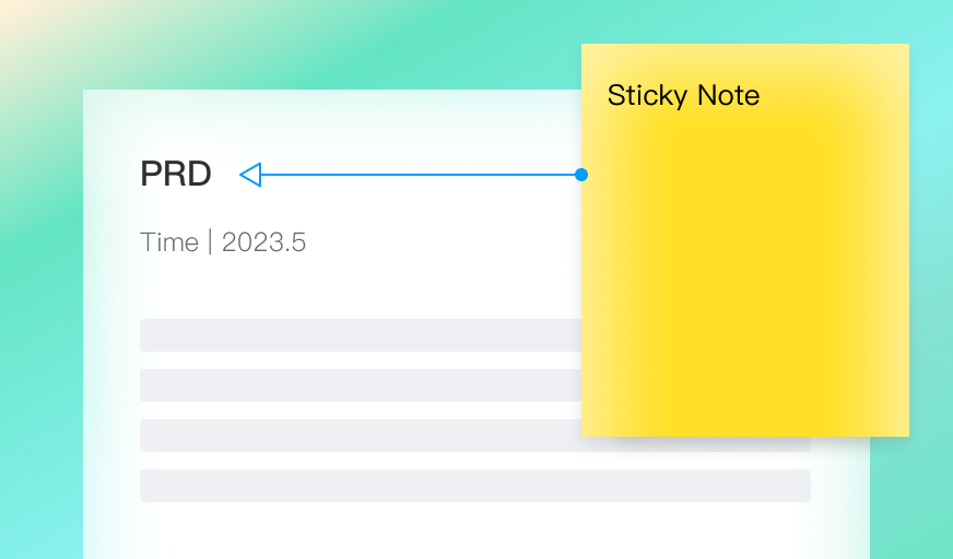
For instance, Sticky Notes are made with default connectors, allowing you to directly snap it to related components and contents after dragging it onto the canvas. There is no need to manually add a line to connect them together and adjust the position, saving time in adding your annotations, requirements and more.

But that's not all – our chart components have received a boost as well. We've introduced new project options, such as "Apple Watch" and "Car infotainment", broadening your design possibilities. Plus, we've enhanced the stability of image exports to further improve your experience. You may explore other improvements about built-in components on your own.
Smart image and text filling ability
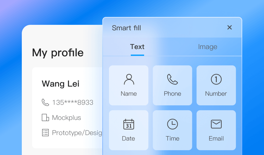
With this update, we've also introduced a new feature called "Smart Fill", which allows you to effortlessly populate your text or image elements with just a few clicks, eliminating the need for time-consuming manual data entry or uploads. Now, you can focus on visualizing your ideas without unnecessary interruptions.

Export artboards as a PDF
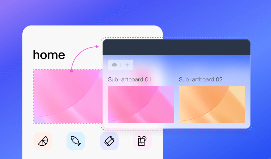
In response to the valuable feedback from our users, we've introduced a new feature that allows you to export your artboards as PDF files, catering to the needs of designers and teams who require PDF design files for seamless sharing and collaboration.
Whether you need to export a single artboard or multiple artboards within a project, you can now do so with ease, putting the power to export in PDF format right at your fingertips.

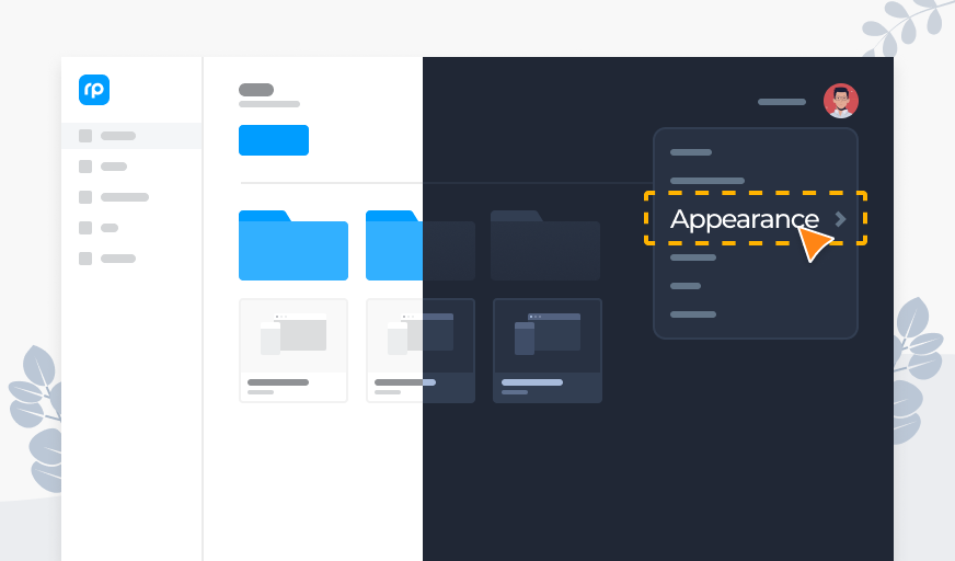
New Dark and Light themes
We now support a Light theme, enabling you to freely switch between the Dark and Light themes according to your preferences:
The Light theme - a theme that makes texts, images and other project content more distinct from a bright background. It is more suitable for daytime or well-lit environments.
The Dark theme - a theme that helps reduce eye strain and offers a more comfortable reading experience. It is ideal for nighttime or low-light environments.
Simply put, both of the Light and Dark modes have their own cons and pros. Feel free to switch between them while using Mockplus RP to tailor your experience to your liking.

Mockplus DT (for collaborative UI design)
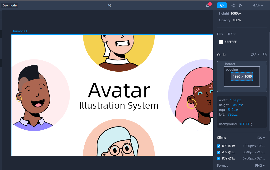
New Development mode
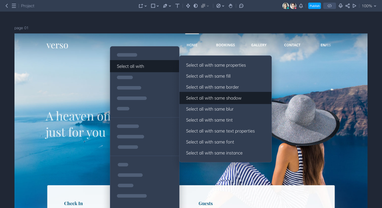
Mockplus DT now supports a new Development mode for developers to translate designs into codes fast. Developers can easily switch from the "Design" mode into this mode, starting to review layer specifications, download design assets, and access CSS code snippets to expedite the development process.
You can now integrate your development team into your workflow by sharing a single link, enabling a smoother collaboration from the early stages.

Free prototyping tool for web and mobile app design
Get Started for Free
Free prototyping tool for web and mobile app design
Get Started for Free
Free prototyping tool for web and mobile app design
Get Started for Free


 Sign up with Google
-3.png)
.png)
