When people enjoy the great convenience brought by mobile apps, it has virtually gone through various of mobile form design examples. The mobile form design is the interaction step with the user in mobile application design, including registration, subscription, user feedback, questionnaire forms, purchase, and sales transactions, and so on. A good form design can help improve user experience, increase conversion rate, and achieve better marketing results.
Each form design page has a specific purpose, either to attract registration or to close a deal. Poorly designed forms or even mistaken designs may lead to the loss of users or transaction failures. Therefore, we need to understand the basic principles of form design, to avoid the mistakes in design.
1. Logical clarity
Forms are the language of communication with the user. Like any dialogue, it should help the parties complete the exchange in a logical way.

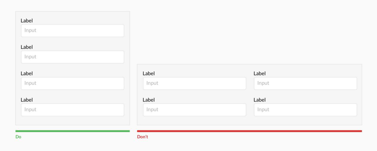
2. Try to use a single column design
Multi-column forms can easily be missed by users and cannot be filled out. The single-form form has a single, direct, and relatively efficient path.

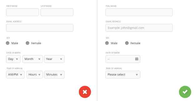
3. Reduce input
The longer the form, the more complex the user's willingness to complete the overall form - especially on a small screen. Minimize the number of input fields to make your forms load faster, especially when you ask the user for a lot of information. Keep the form as short as possible.

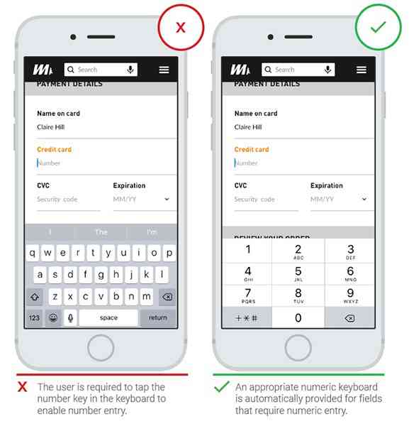
4. Provide suitable input methods
It’s recommended to provide different keyboards, such as when input account, password, fill in the mailbox, enter the nickname, etc.. That will minimize input errors, help users quickly complete the fill.

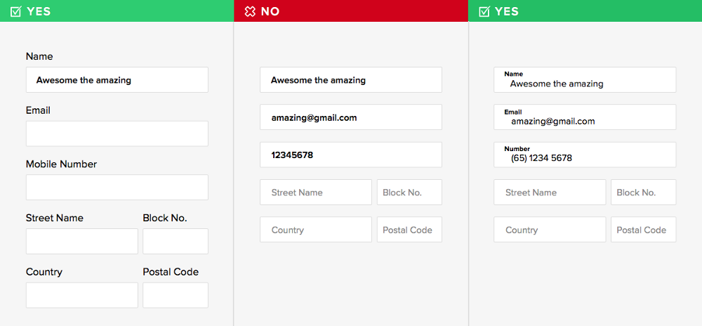
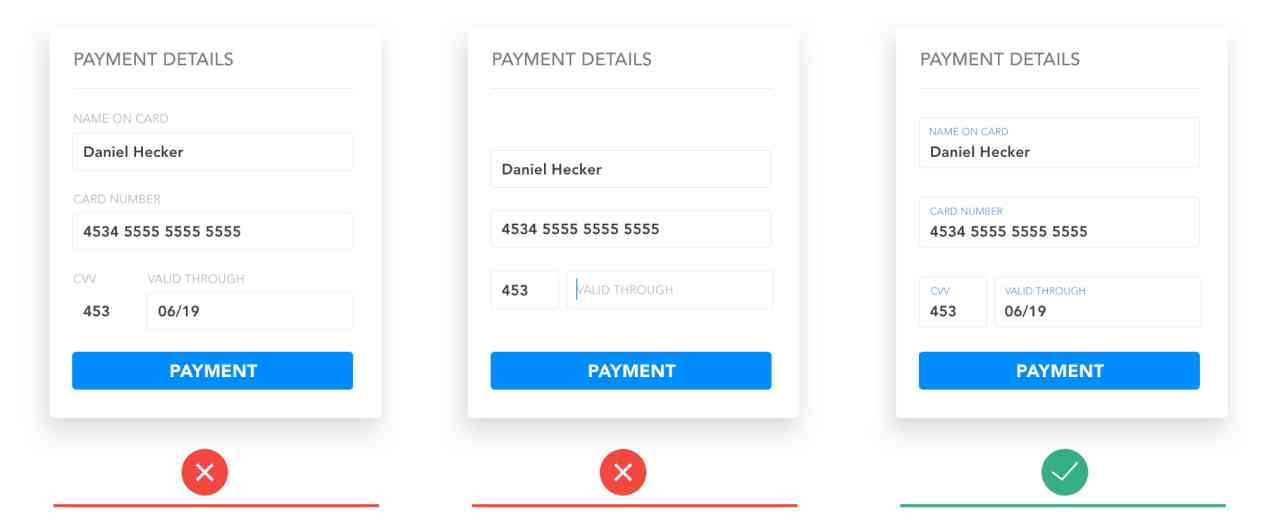
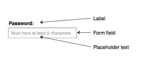
5. Avoid using labels as placeholders
There is a design pattern, it uses a label as a placeholder in the input box and disappears automatically when the user clicks on the input. This kind of design is simple, but it's easy for users to forget what fields they need to enter when they type, and it also creates problems.

5 Best Mobile Form Design Examples for Better UX in 2018
1. Dropbox - by Sam Atmore

Form design principles:
- Carousel display of landing and registration page
- Clear CTA tips
In Sam's login/registration form design example, it has a clear logic of login and registration.
At first, a single-choice form design. Before the user starts to use the app, he/she just needs to select one of the two options and proceed with the label prompt. Even if misoperation, another option can be selected with a simple swiping chart
Secondly, the CTA button on the login and registration page is very clear, which allowing the user to clearly define the intent and function of the behavior with a strong guidance.
2. Location Switching - by Nimasha Perera

Form design principle:
- Intelligent auto fill options
Form design is increasingly integrated into technology elements. For example, with the automatic positioning function, intelligent filling of information can be performed based on the current position. This operation saves the user the choice of geographical location and currency conversion process, saving a lot of time and effort. While in the traditional positioning form design, facing the position switch, it is often a long list of city names, often dazzling.
3. Form Validation - by Emmanuel Torres

Form design principle:
- Obviously visible prompts
In the process of login or registration, the user ideally completes the information and submits it. However, in practice, errors are unavoidable. Therefore, the form design needs to take into account visible and recognizable information prompts to remind users of incorrect information. Instead of telling them they have made mistakes after they have completed the information.
4. Show/Hide Password - by Claudio Scotto

Form design principle:
- Visualized password tips and forgotten password tips
Another problem that users often encounter is forgetting passwords because most password entry fields are blocked for security reasons. The recommended action is to add a "show password" checkbox or icon next to the password field. Once the user clicks on it, they will unblock the password and view their wrong location. This type of design is simply perfect for mobile keypads.
5. Explain Everything- by Anny

Form design principle:
- Iconization of label design
In the mobile form design style, there is a design scheme that is to design labels as icons, so that the picture becomes flexible and more concise. Because of the icon's prompting function, the user can also clearly know what fields have been entered when the input box has been entered.
The bottom of the multi-platform association registration also provides users with a more convenient way to register. That allows users to complete application registration more conveniently. This application prototype designed by Mockplus combines the two factors and is a very wise choice for mobile form design.
As a prototype tool for both mobile and web project design, Mockplus has unique advantages in form design. The elements needed for form design can be easily found in the software. For example, placeholders, icons, input boxes, numeric keypads, and so on.

(Mobile form design elements designed by Mockplus)
Conclusion:
Whether it is to fill in a mobile form or a web form, the user's hesitation is inevitable. As a designer or developer, learning to make this process easier, achieving the set goals is the ultimate goal. Mobile form design should be an advantage, not a weakness. An excellent form design should be highly targeted, have thoughtful details and experience, perseverance in improvement and adjustment, efficient and quick submission, and smooth processes.
Free prototyping tool for web and mobile app design
Get Started for Free
Free prototyping tool for web and mobile app design
Get Started for Free
Free prototyping tool for web and mobile app design
Get Started for Free



 Sign up with Google
